Selected projectsPortfolio
Designing and building my portfolio with AI, from template to live site
The challenge
Every good design starts somewhere. Mine started with a Framer template, plenty of inspiration and a rabbit hole of other designers’ portfolios. I found some brilliant ideas, but also plenty of inaccessible experiences and case studies that left me wanting more. Rather than keep tweaking a template, I saw an opportunity to start fresh: create a portfolio that was more considered, easier to explore and, most importantly, unmistakably mine.
- Goal
- Design a portfolio that feels intuitive, engaging and distinctly mine. From the first interaction to the final case study, every detail should have a purpose, making it effortless for visitors to explore, discover and connect with my work.
Research and structure
I started with a UX audit of my old site, a Framer template I’d adapted rather than designed. The numbers were hard to ignore:
2.8
screens to scroll before reaching any work
16 of 18
images with no alt text
4.2:1
contrast on project text, below the 4.5:1 AA minimum
“Atomic”
the template’s name, still in the page title
To see what good looked like, I ran an AI-enabled competitor analysis, using Claude Research to review more than 15 product designer portfolios. Four stood out for the same reason: calm, intentional design that showed who the designer was, what they’d done and the story behind their work.
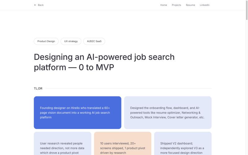 Devayani Gadgil
Case studies that open with a short summary of the key facts.
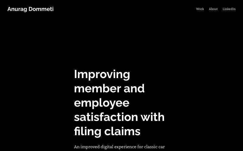 Anurag Dommeti
Case studies told as a story, from the problem to the outcome.
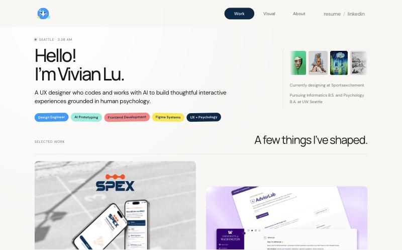 Vivian Lu
Selected work straight after a short introduction.
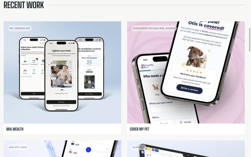 Jana Halfarova
Recent work up front, each project tagged by platform.
- Takeaway
- The four portfolios that stood out, with what I noticed in each. Each links to the designer’s site.
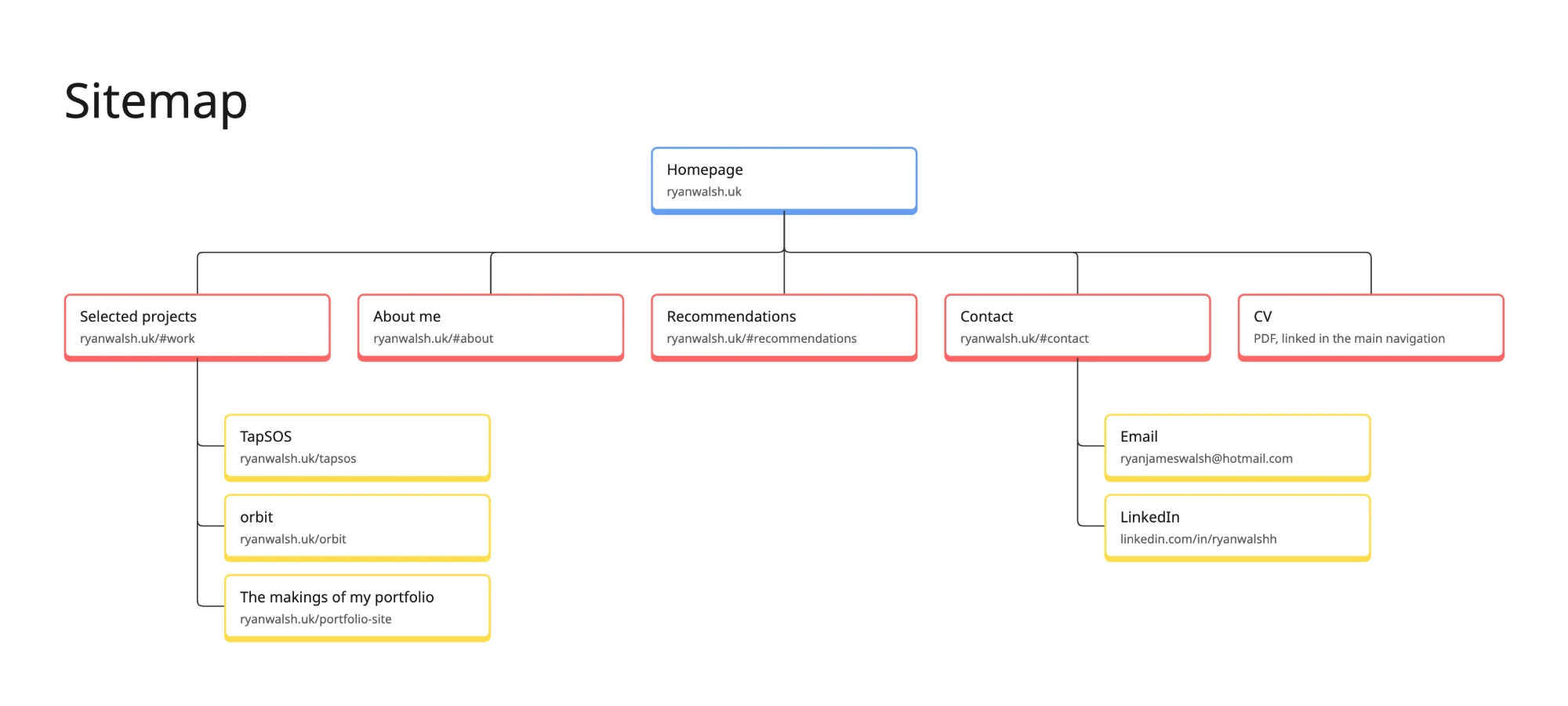
- The strongest portfolios lead with work, not biography. That shaped a single-page homepage with dedicated case study pages.
Why it’s structured this way
- Work comes first. On my old site, projects started almost three screens down, after About and Skills. Now Selected projects is the first section after the introduction, as it was in the portfolios I reviewed.
- Every case study is one click away. My old site got this right, so each project card still opens its case study directly.
- The CV is always a tap away. My old CV opened on Canva. It’s now a PDF on my own site, linked from the main navigation.
Where AI was used
AI did part of the work at four of the five stages, and every design decision stayed mine.
-
01Research
AI-assistedClaude Research reviewed more than 15 portfolios. I chose the four that stood out and what to take from them.
-
02Design
By meLayouts, components and tokens, set in Figma before any code was written.
-
03Build
AI-assistedClaude Code wrote the code from my Figma designs and CLAUDE.md. I checked each component against the design.
-
04Review
AI-assistedAI critiqued the site against Nielsen’s heuristics. I decided which findings to act on.
-
05Ship
AI-assistedClaude Code opens and merges each pull request. Nothing goes live until I’ve seen it.
Building with AI
I built the site myself with Claude Code, treating the AI as a fast pair-programmer while I owned every design and accessibility decision.
AI ran through the whole project, not just the code: Claude Research for the portfolio review, Claude Code for the build and the design reviews, and my own GitHub repository to ship and track every change.
My own GitHub repository
I set up a GitHub repository for the site and publish it through GitHub Pages on my own domain. Claude Code works against that repository, and every change goes through a pull request, so each design decision has a clear, reviewable history.
Working with Claude Code
- Design first. Final layouts, components and tokens were set in Figma before any code was written.
- Engineer the context. Before the build, I wrote the context the model works from: a project file (CLAUDE.md) setting out the design tokens, component rules and accessibility requirements, so output stays on-system. It’s context engineering, briefing the AI the way I’d brief a developer joining the team.
- Build component by component. Navigation, project cards, the experience timeline and so on, each checked against the Figma design before moving on.
- Review and correct. I checked every build in the browser and with assistive tech, and corrected the AI where it drifted, for example square white corners showing behind the rounded phone frames on my TapSOS screens, which I spotted in review and had clipped just inside each frame.
- Ship and iterate. Changes, such as adding the private project card, take minutes rather than days.
## Design tokens
- --violet #5d51ff (accent, 5.1:1 on white)
- --pen #ff2fad (hand-drawn marks and focus rings only, never small text: 3.4:1)

## Components
- Project cards (.project): a badge, a hover/focus overlay, and the full card text in .visually-hidden for screen readers

## Accessibility (non-negotiable)
- WCAG 2.2 AA. Measure contrast for every new text colour and background before shipping
- One <h1> per page; no skipped heading levels
> Can we ensure there is no border around the screens? I can see a slight bit of white around the screen.
The screen images have light corners outside the rounded phone frame. I’ll clip each image just inside the frame’s curve.
+ clip-path: inset(0.5% 0.6% 0.6% 0.6% round 13.6% / 6.9%);
Checked every screen on the wall: no white corners left.
> Push it live
Opened a pull request, merged it, and GitHub Pages rebuilt ryanwalsh.uk.
> ▌
Rounds of iteration on colour and type
Very little landed first time. Colours and typography went through several rounds, and every round was checked for accessibility before it shipped.
-
Round 1
Case study headers
Moved from a dark violet gradient to the homepage’s light, grid-paper ground, then dropped the grid altogether for a plainer, calmer read.
-
Round 2
Typography
Case study titles moved onto the homepage’s type scale (32, 40 and 56px at regular weight), and intro text was resized to sit on two lines without dropping below 18px.
-
Round 3
Wordmark
A braille “RW” mark gave way to “Ryan Walsh.” with a pink full stop: printed braille can’t be read by touch on a screen, so the mark was decorative rather than inclusive.
-
Round 4
Colour and contrast
Every new colour was measured before it shipped: the TapSOS teal at 5.36:1, the problem and answer cards at 5.36:1 to 6.31:1, and a darker overlay that lifts text on light cards to 7.99:1.
-
Round 5
AI-assistedAI-enabled UX audit
I ran an AI-assisted critique of the site against Nielsen’s usability heuristics, and used its findings to decide what to change next. I acted on several of its findings: I replaced the braille wordmark, showed what testing changed on TapSOS, and fixed a dead end at the end of orbit. I rejected its rewrite of my About section, because the voice wasn’t mine, and kept my own words.
This gave me a working understanding of how my components map to HTML and CSS.
Where I overruled the AI
Some suggestions sounded right but would have failed the people the site is for. This is one I caught.
- What the model suggested
- ARIA and custom keyboard behaviour for moving through part of the site.
- Why it sounded right
- Claude explained the approach confidently, so it was easy to take on trust.
- What I noticed
- When I tested it with the keyboard myself, focus got trapped. Anyone navigating by keyboard or screen reader would have been stuck.
- What I did instead, and the result
- I re-prompted Claude with what I’d found: an error when using the keyboard to move through the portfolio. Claude removed the custom behaviour. I tested again, and the keyboard worked as intended: I could move through the whole portfolio easily.
Design decisions
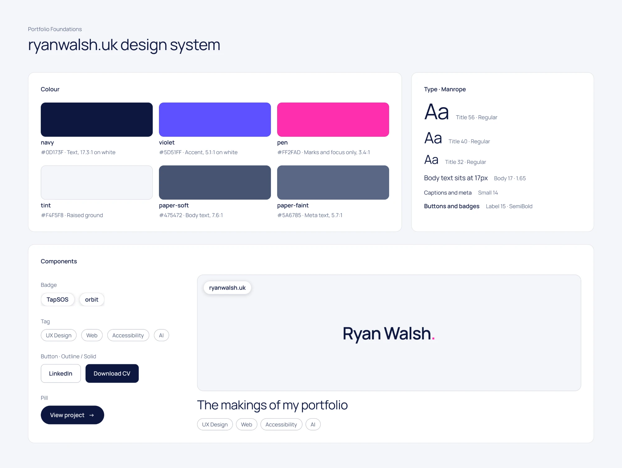
I designed the site in Figma as a small design system first, then built pages from it.
- Light, high-contrast palette. A pale grey and white base with navy text lets project imagery stand out, with violet and a pink accent used sparingly. I checked every text and accent pairing with Stark against AA.
- Type scale. Manrope throughout, with headings at 32, 40 and 56px over 17px body text, so the page can be scanned in seconds.
- Components. Project cards, tags, buttons and recommendation cards built with auto layout and variables, so light and dark tokens and spacing stay consistent.
- Project card states. Live case study, in progress, and private (available on request). Each state has its own visual treatment, so status is clear without reading the small print.
- Microinteractions. Hovering over or tabbing to a project card zooms its image and fades in a short summary with a “View case study” link, so mouse and keyboard users get the same preview. Every link and button shows a pink focus ring. The “Coming soon” band on the Together card scrolls on a slow loop. With reduced motion turned on, the band stops, the pen marks appear already drawn, and images and videos stay still.
Accessibility
Accessibility was built in from the start rather than checked at the end, but it isn’t the whole story. Some details, like the scrolling “Coming soon” band, are there purely for character, and they step aside for anyone who has reduced motion turned on.
- Skip to content link as the first focusable element, so keyboard and screen reader users can bypass the navigation.
- Semantic structure: one H1, a logical heading order, and ordered lists for experience and education.
- Visible focus states on every link and button: a 2px pink outline with at least 3:1 contrast against the page, which meets the WCAG 2.2 focus appearance guidance.
- Target size: every link and button is at least 24×24 px (WCAG 2.2, 2.5.8), measured on phone and desktop. Main buttons are 44 to 48 px tall.
- Descriptive links: project cards announce the project name and “View case study”, not just “Read more”.
- Tested with keyboard-only navigation.
Reflection
A portfolio is never really finished, and that’s perhaps the biggest takeaway from this project. There’s always another interaction to refine, another idea to explore or a better way to tell a story. This experience helped me appreciate the balance between creative expression and purposeful design. It’s not just about making something look good; it’s about making sure every decision has a reason behind it.
What I learned
Designing and building it myself made me faster at spotting where a design will be hard to build, and more precise in my specs.
Next project
orbit
A heads-up display app for neurodiverse drivers.
View case study