Selected projectsorbit
Project 01 · Final-year project
orbit Building for neurodiversity: a smarter way to drive from start to finish
orbit puts directions in a driver’s peripheral view, so they can follow a route without taking their eyes off the road. It’s built around the needs of neurodiverse drivers, who are poorly served by standard infotainment systems.
- Role
- Research, UX and UI
- Team
- Solo project
- Timeline
- Sep 2022 to May 2023
- Platform
- Mobile app and HUD
- Tools
- Figma, Notion, Illustrator

01The problem
Infotainment systems are built for the average driver.
Car manufacturers compete on the driving experience, and infotainment systems are a big part of that. They’re practical, but they’re also distracting, especially for neurodiverse drivers, because they offer little flexibility in how information is shown while on the move.
An estimated 15% of the UK’s population is neurodivergent, nearly 1 in 7 people, so driving can be harder to take on than it should be.
The brief
A user-centred concept that helps neurodiverse drivers see and follow directions within their peripheral view, without getting distracted on the way to their destination.
What it needed to do
- Show directions without pulling attention off the road
- Offer flexible accessibility options on the go
- Be shaped by what neurodiverse drivers say they need
- Feel simple to set up and easy to trust
02Why it matters
Distraction is a road safety problem
2,563
accidents in 2021 were caused by distractions in the vehicle, and 63 of them were fatal.1
73%
of the drivers I surveyed struggle to read directions.2
92%
said they would benefit from using a HUD.2
Every 16 minutes, someone is killed or seriously injured on UK roads. Something needs to change.
Sources: 1. UK road casualty figures for distractions in the vehicle, 2021. 2. My own survey of drivers of all ages.
03Research
Understanding what drivers need and want
Starting with the people, not the technology.
- Surveys
- Drivers of all ages, on how they use infotainment and what matters when reaching a destination.
- HUD research
- How head-up displays work, and their pros and cons.
- Competitor analysis
- What already exists, and where the gaps are.
- Designing for neurodiverse users
- Audits and user overviews to shape the brief.
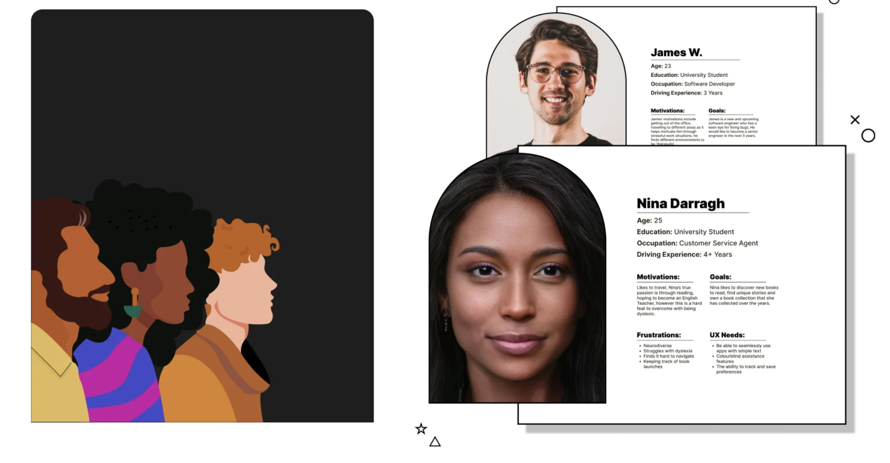
- Personas
- Two target users, with their motivations, frustrations and needs.
- Pitching the idea
- Testing the concept early, then adjusting after feedback.
Image coming soon
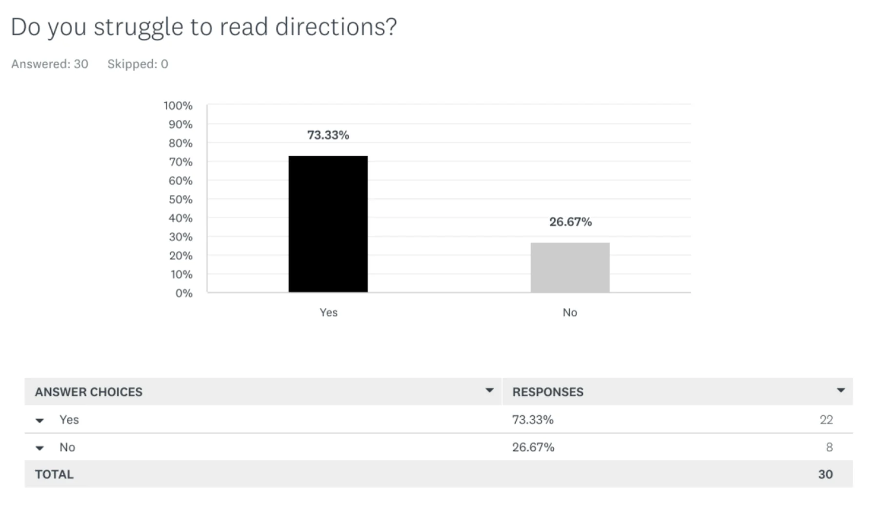
Image coming soon
04Designing for neurodiversity
Flexible by default, so drivers can make it their own
Wireframes made the idea tangible and showed the details a driver would want in everyday use. From there I refined the onboarding, the settings and the visual language over two semesters.
The brand and interface were shaped for neurodiverse users from the start, with clear type, considered scale, and colours chosen so they wouldn’t cause discomfort while driving.
- Onboarding
- A simple set-up, refined over several rounds.
- Accessibility settings
- Options a driver can adjust to suit them.
- Colourblind assistance
- Display options for drivers with colour vision differences.
- Typography and scale
- Readable at a glance, in peripheral view.
- Brand guidelines
- A calm, car-inspired brand optimised for neurodiverse users.
Features
- Head-up display
- Colourblind assistance
- Adjustable text size
- Calming colour schemes
- Voice command centre
- Monthly mileage reports
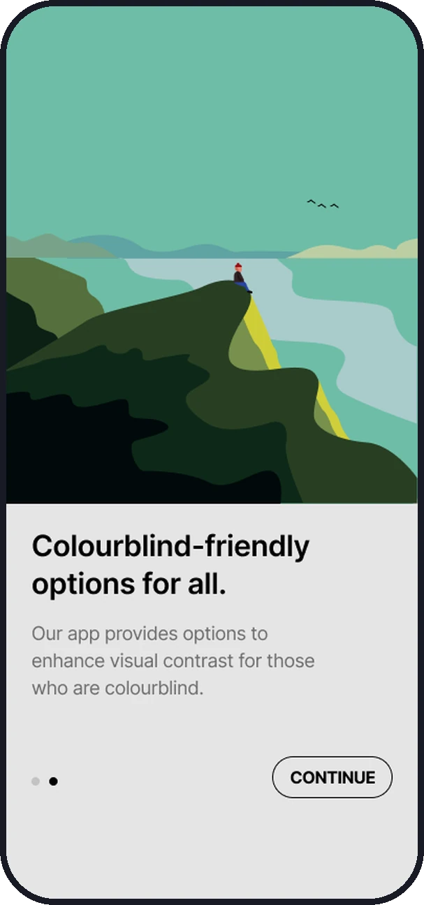
Image coming soon
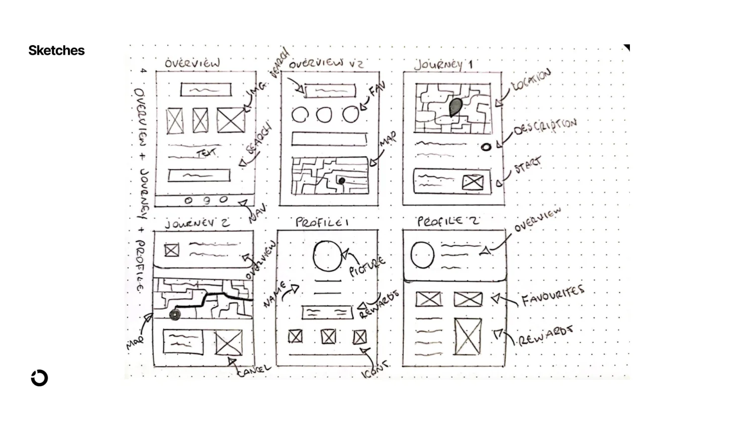
Image coming soon
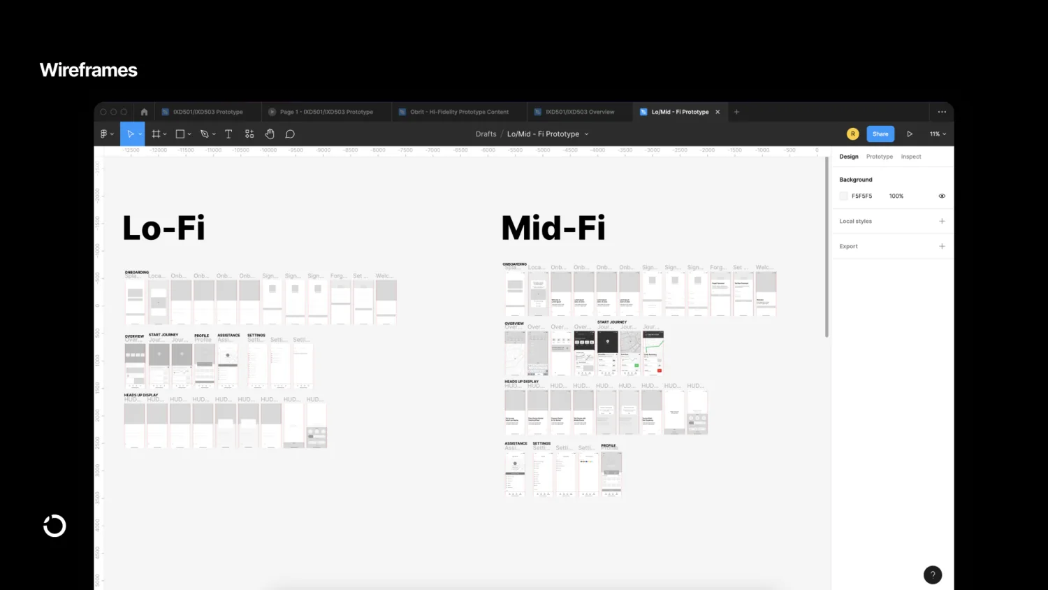
Image coming soon
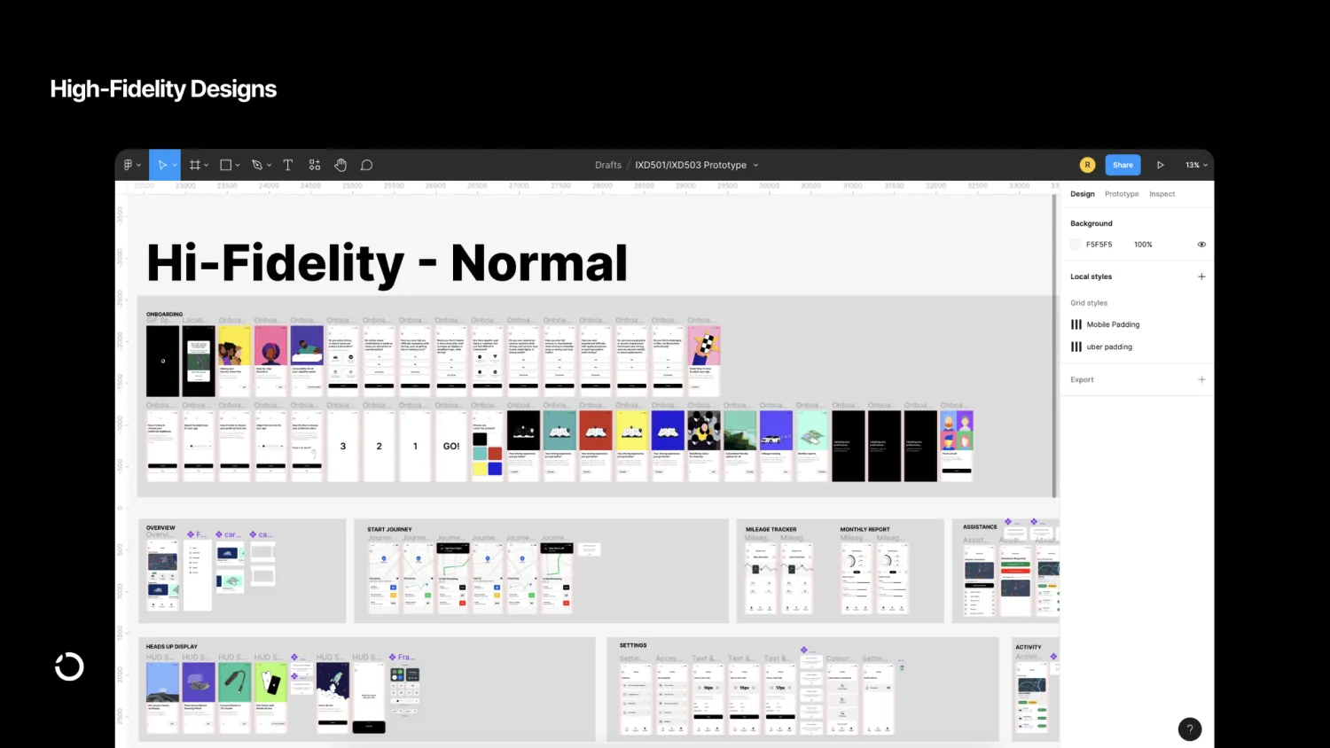
Image coming soon
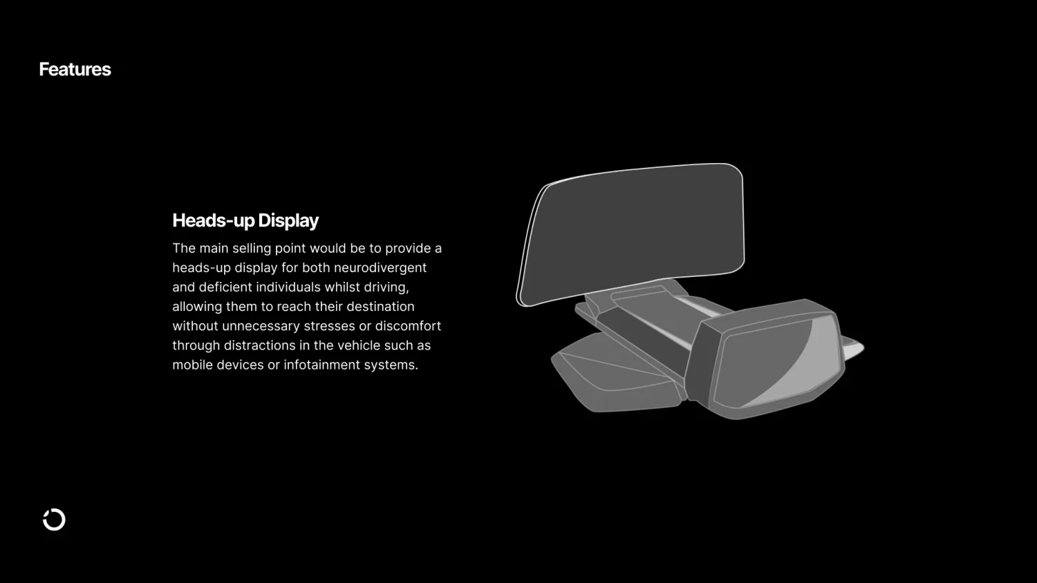
Image coming soon
05Testing
Testing it remotely, then refining
In the second semester I ran a remote usability testing phase using Maze, then gathered the results and feedback to shape the next round of changes. I also took the concept to industry reviewers and co-founder sprints, using their feedback to decide where orbit should go next.
A concept for neurodiverse drivers is only useful if it works for them, so each round of feedback changed the design.
06Outcomes
The outcomes
From remote usability testing on Maze with 20 participants.
80%
Beneficial to use
16 of the 20 testers said orbit would be a beneficial app to use, helping them navigate busy streets with or without a HUD.
75%
Easy to personalise
15 of the 20 testers found the accessibility settings easy to find and adjust.
90%
Directions at a glance
18 of the 20 testers could read the directions quickly without losing focus.
70%
A clear first run
14 of the 20 testers found the onboarding clear and quick to complete.
07Reflection
There’s a real need for orbit, and the people who’d gain most are often the last to be designed for.
The results show there’s a genuine place for a product like this on the open market. People with accessibility needs stand to benefit most, yet they’re too often overlooked as technology moves faster.
The biggest challenge was balancing comprehensive support with a simple, intuitive interface. Finding the right tone for the brand took several iterations too, so it felt like part of the car without causing discomfort or getting in the way of driving.
What’s next
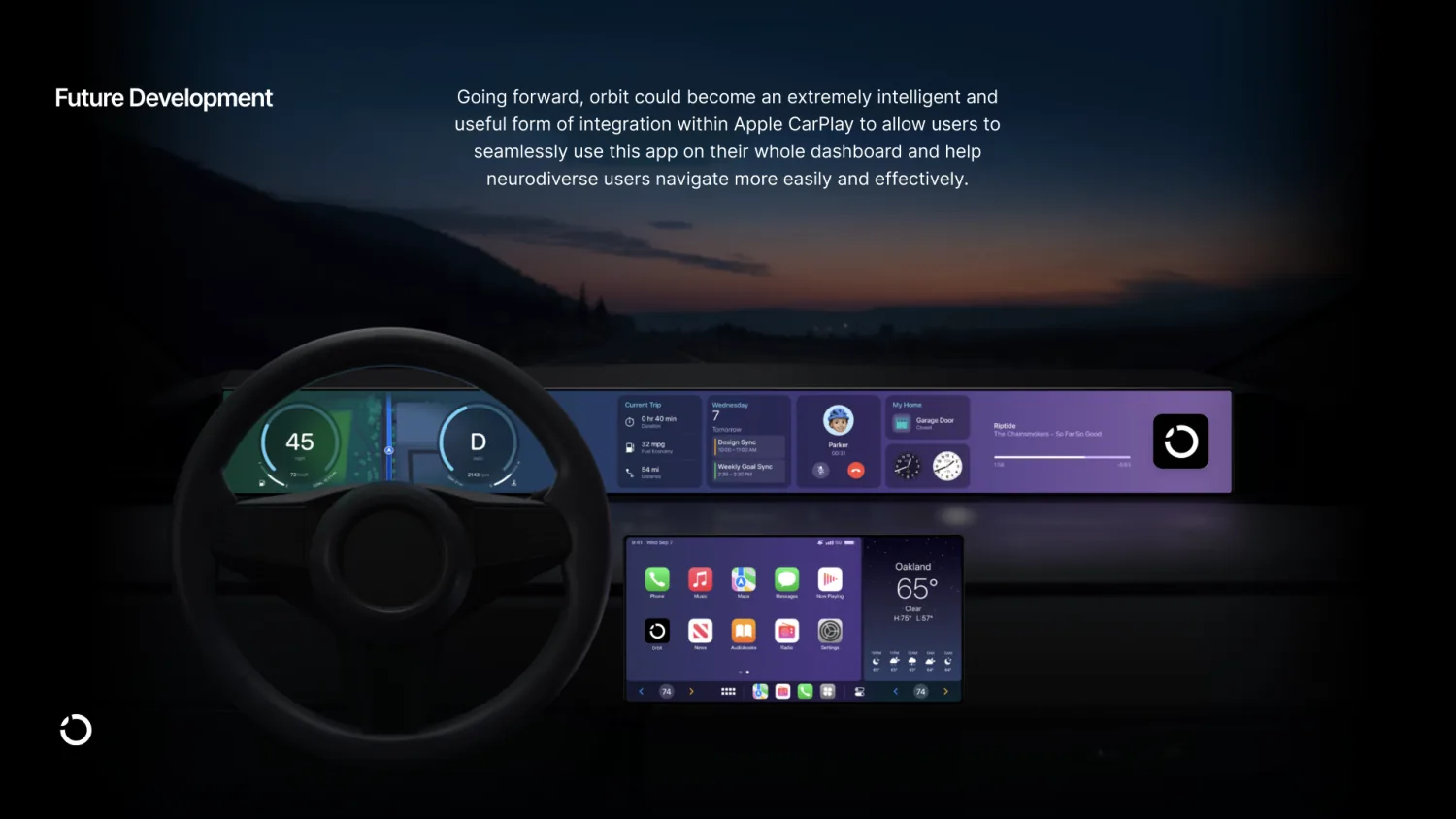
Going forward, orbit could integrate with Apple CarPlay, so drivers can use it across the whole dashboard and navigate more easily and effectively.
Image coming soon
08The full project
Everything behind orbit
The prototype and the documents that came with it.
- App prototype
- The overall design concept for the app.
- Research blog
- The idea for orbit through to the finished concept, week by week.
- Brand guidelines
- How the brand is optimised for neurodiverse users.
- Launch strategy
- How orbit is promoted, before and after launch.
- Colophon report
- An in-depth look at how orbit was developed.
- Viva presentation
- The final-year presentation, covering the project start to finish.
More selected work
Keep exploring.
Together
Your care, all in one place: GP, hospital and pharmacy appointments together on one timeline.
In progress, coming soon