RYAN WALSH
TapSOS
Designing an accessible
emergency communication experience
01

The Problem
Emergency services still assume you can speak.

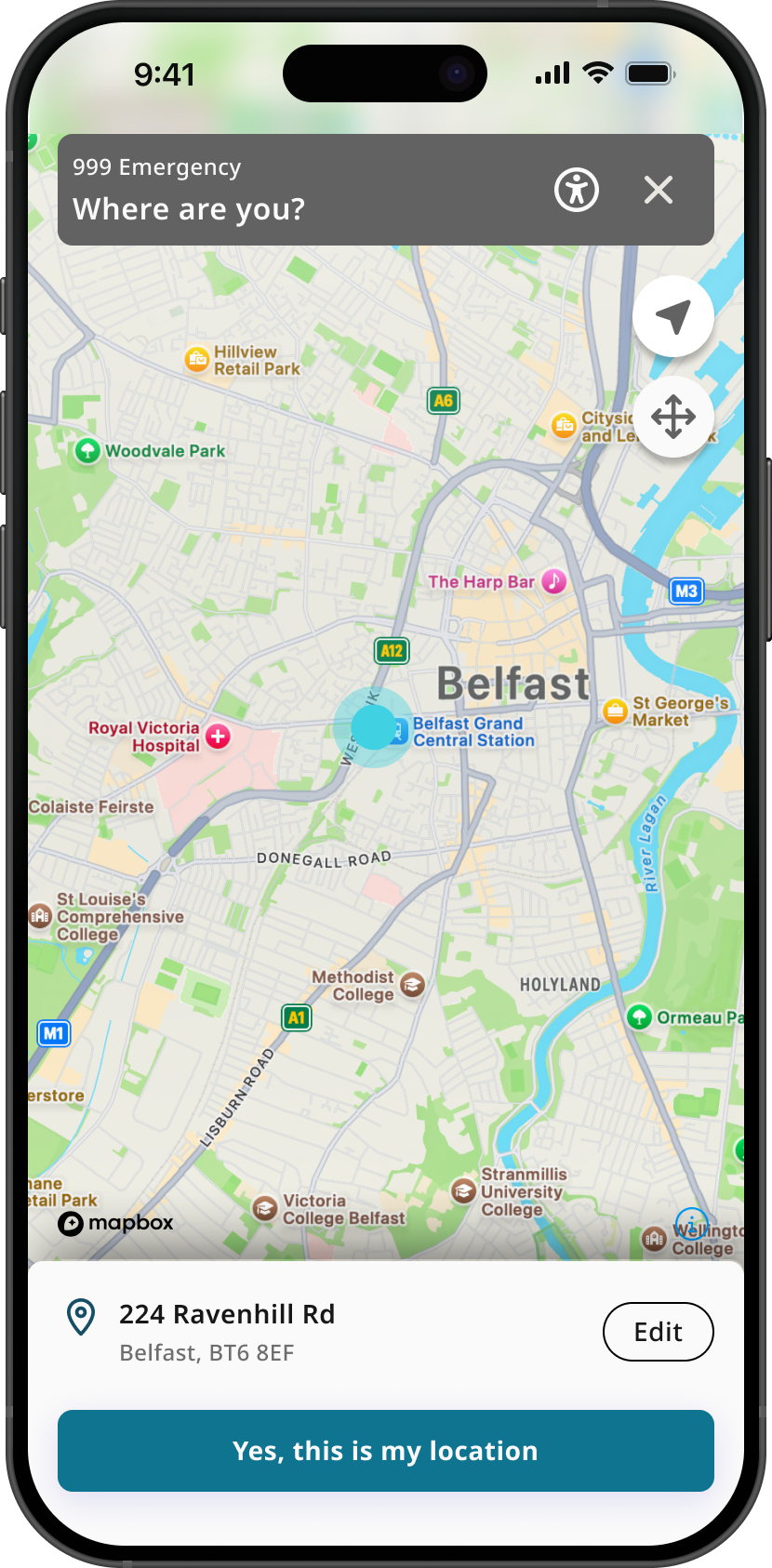
999 in the UK relies on a voice call — which excludes anyone who can’t speak during a crisis, whether through disability, a medical event, or a situation where making a sound isn’t safe.
The brief: a fast, safe, accessible alternative that reduces stress while giving responders accurate information.
SUCCESS CRITERIA

Contact help without speech
Cut cognitive load under pressure
Meet a range of communication needs
Scale via a growth-ready system
02
WHY IT MATTERS
The scale of the need

1 in 3
adults in the UK are deaf, have hearing loss or tinnitus.
55+
Over half the population aged 55+ have hearing loss.
2.5B
people worldwide projected to have hearing loss by 2050
This wasn't an edge case. Designing for people who can't speak is designing for millions — and for anyone, on their worst day.
Sources: ¹ ² RNID, Prevalence of deafness and hearing loss · ³ WHO, Deafness and hearing loss
03
DISCOVERY
Owning discovery end-to-end
Evidence-based decisions, not assumptions

01
User research & journey mapping
Understanding real moments of crisis and where voice fails people.
02
Competitor analysis
Direct and indirect — mapping what exists and where the gaps are.
03
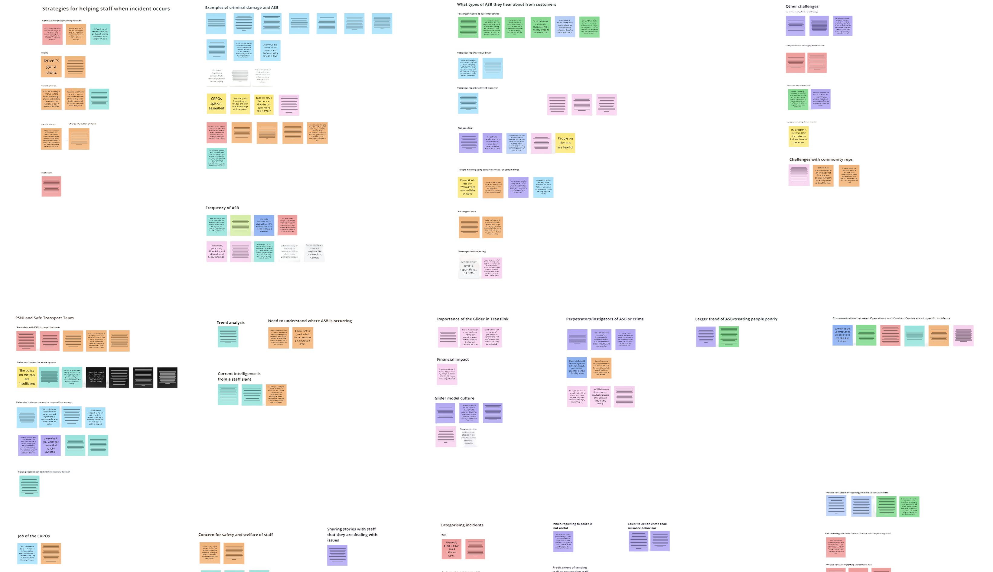
Affinity mapping
Clustering findings into the themes that shaped priorities.
04
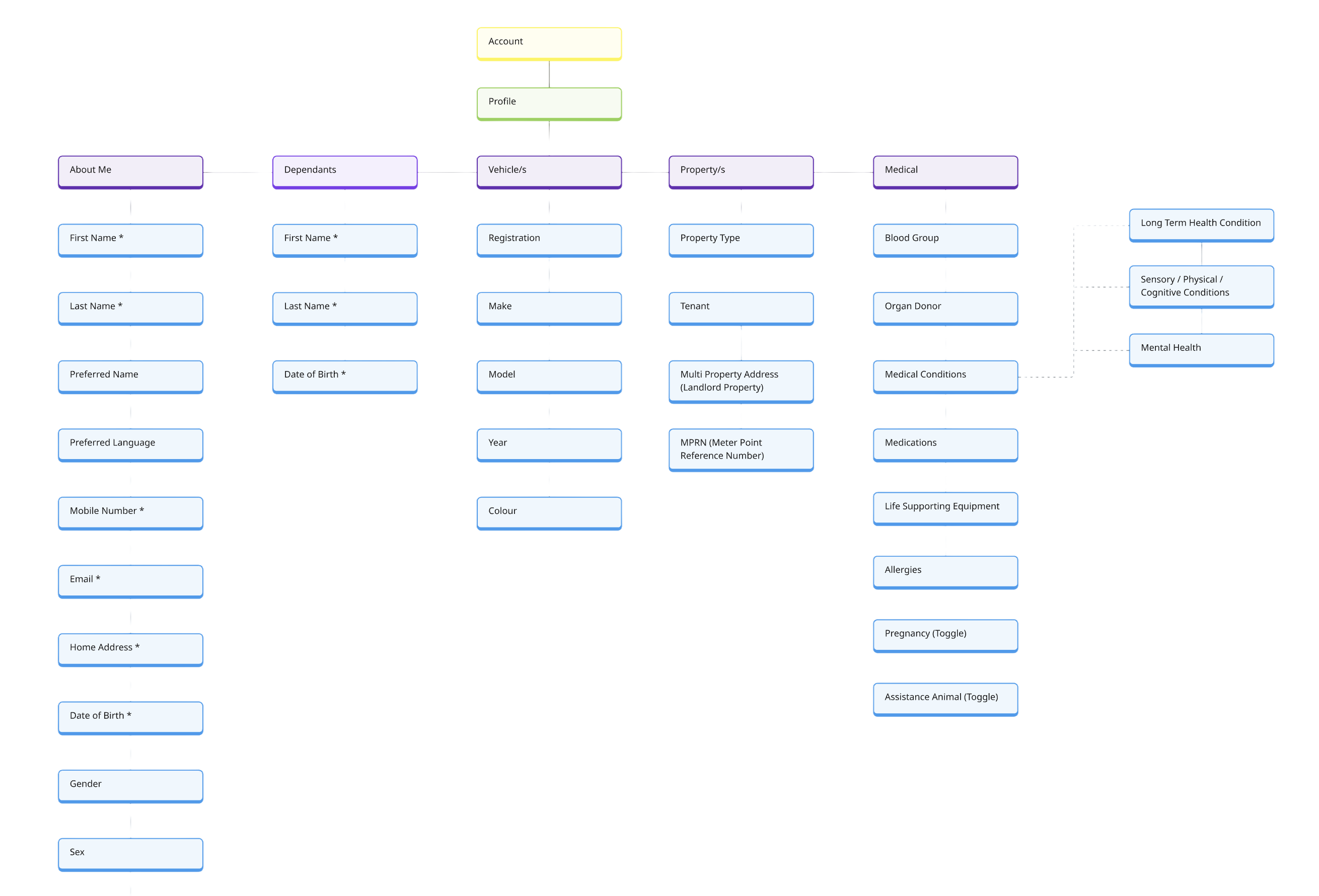
Site maps & storyboards
Sketching structure and scenarios before touching Figma.
05
Collaborative teamwork
Bringing the team into the problem to align early.
06
Defined success criteria
Clear measures so design choices could be judged, not debated.
04
Accessibility
Accessibility was not an afterthought
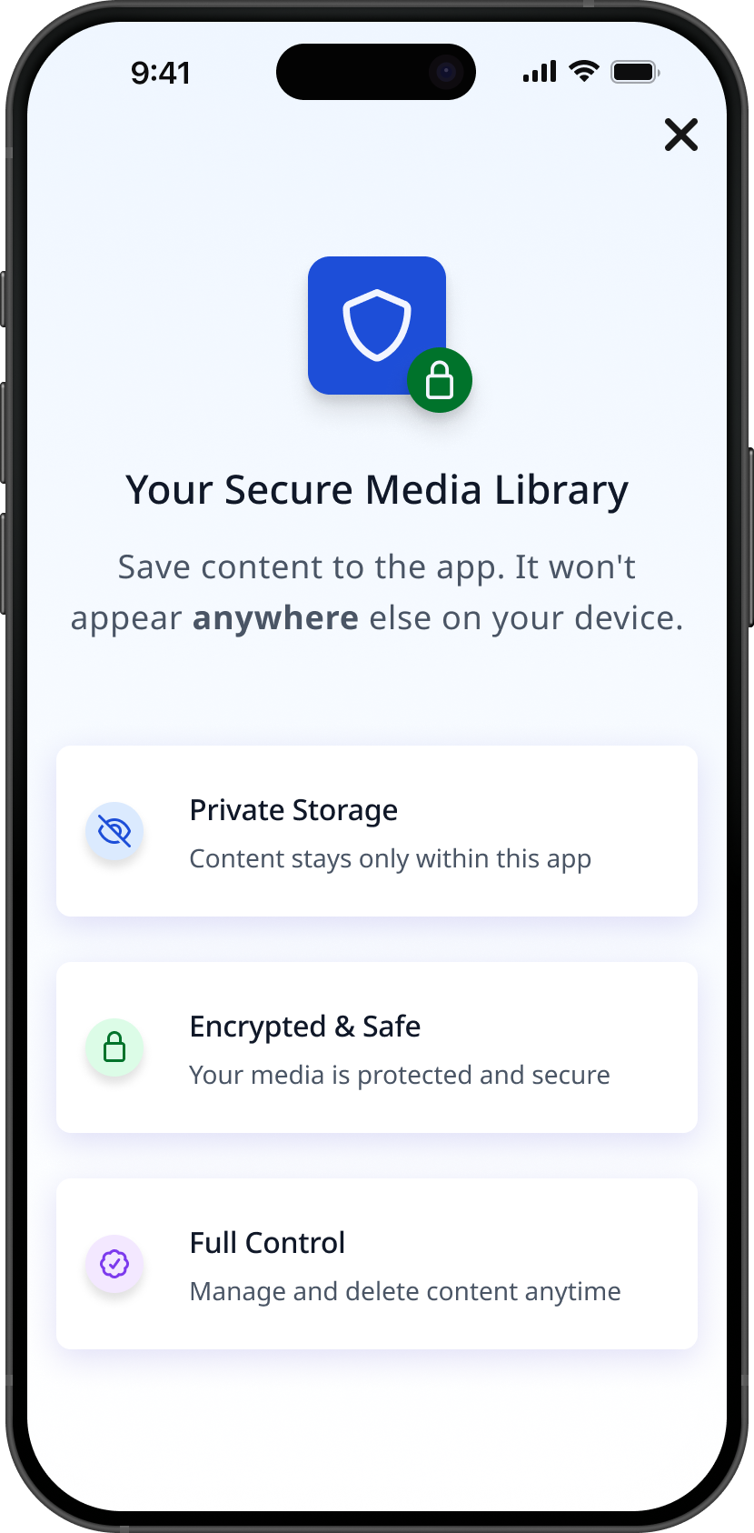
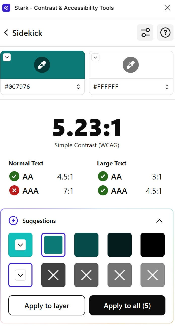
Accessibility was treated as a core design priority rather than a final consideration. Every design decision was made with the goal of reducing barriers and enabling users to act quickly and confidently when it mattered most.

Colour contrast
Legible for users with visual impairments.

Typography
Sized and spaced for fast scannability under stress.

Touch targets
Generous, for users with limited dexterity.

Navigation
Stripped to minimal decision-making.

Status indicators
Reassurance that an action actually completed.

05
From Sketch to System
Lo-fi to a scalable design system
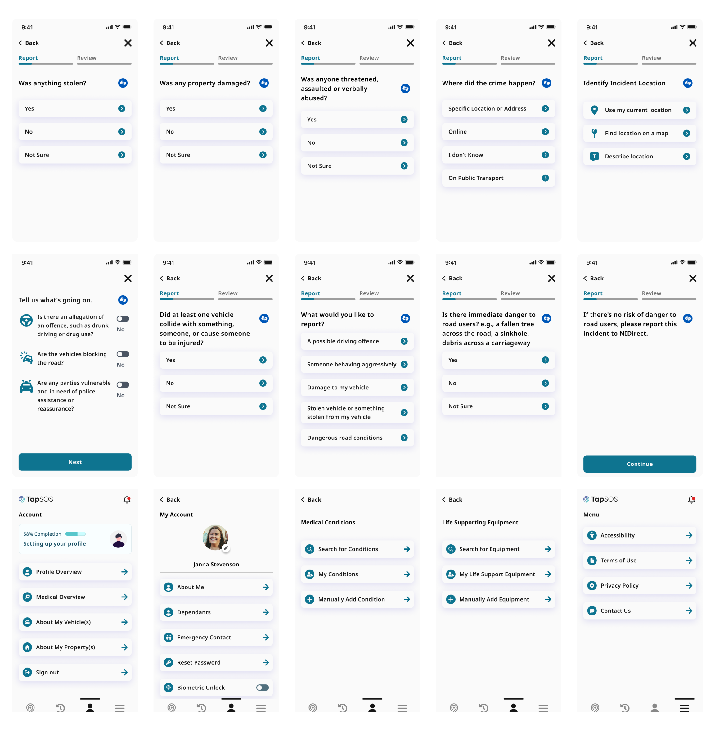
I moved from lo-fi wireframes through mid-fidelity flows to interactive prototypes, simplifying interactions and hierarchy at each pass.
Colours, typography, spacing, components and interaction patterns were defined early — so the product stayed consistent, accessible and ready to grow.
System Foundations
Buttons
Input fields
Avatars
Navigation
Colour tokens
Type scale
Spacing
Status states
06
Validation
Testing with the people it’s for
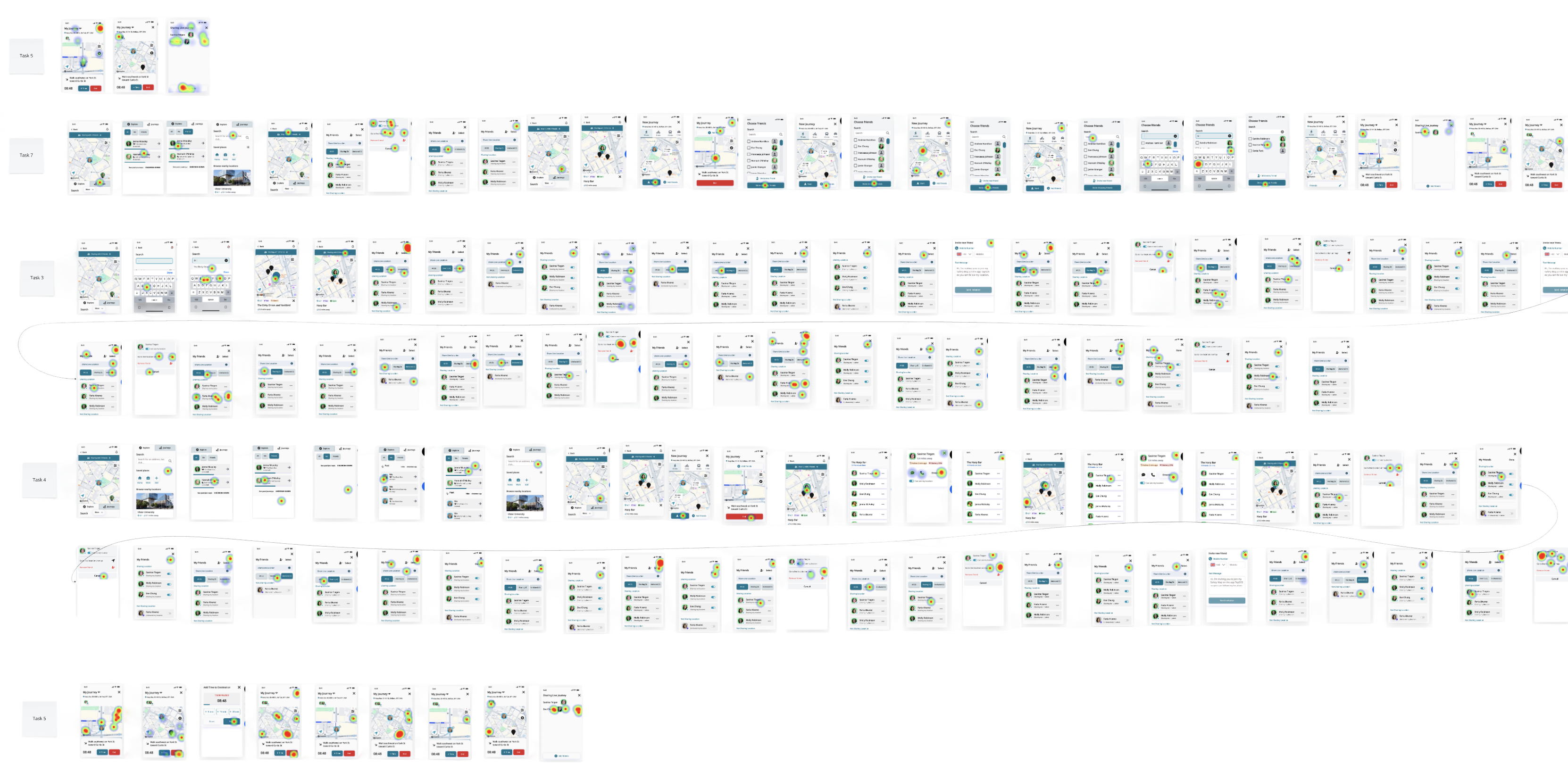
High-fidelity designs were validated in usability testing with members of the Deaf community and users with varying communication needs — working alongside interpreters. Their feedback drove multiple rounds of iteration.
Instead of asking if they liked the interface, I observed their behaviour: could they complete the journey, where did they hesitate, what did they misunderstand, and where did the interface act unexpectedly? Testing challenged our assumptions.
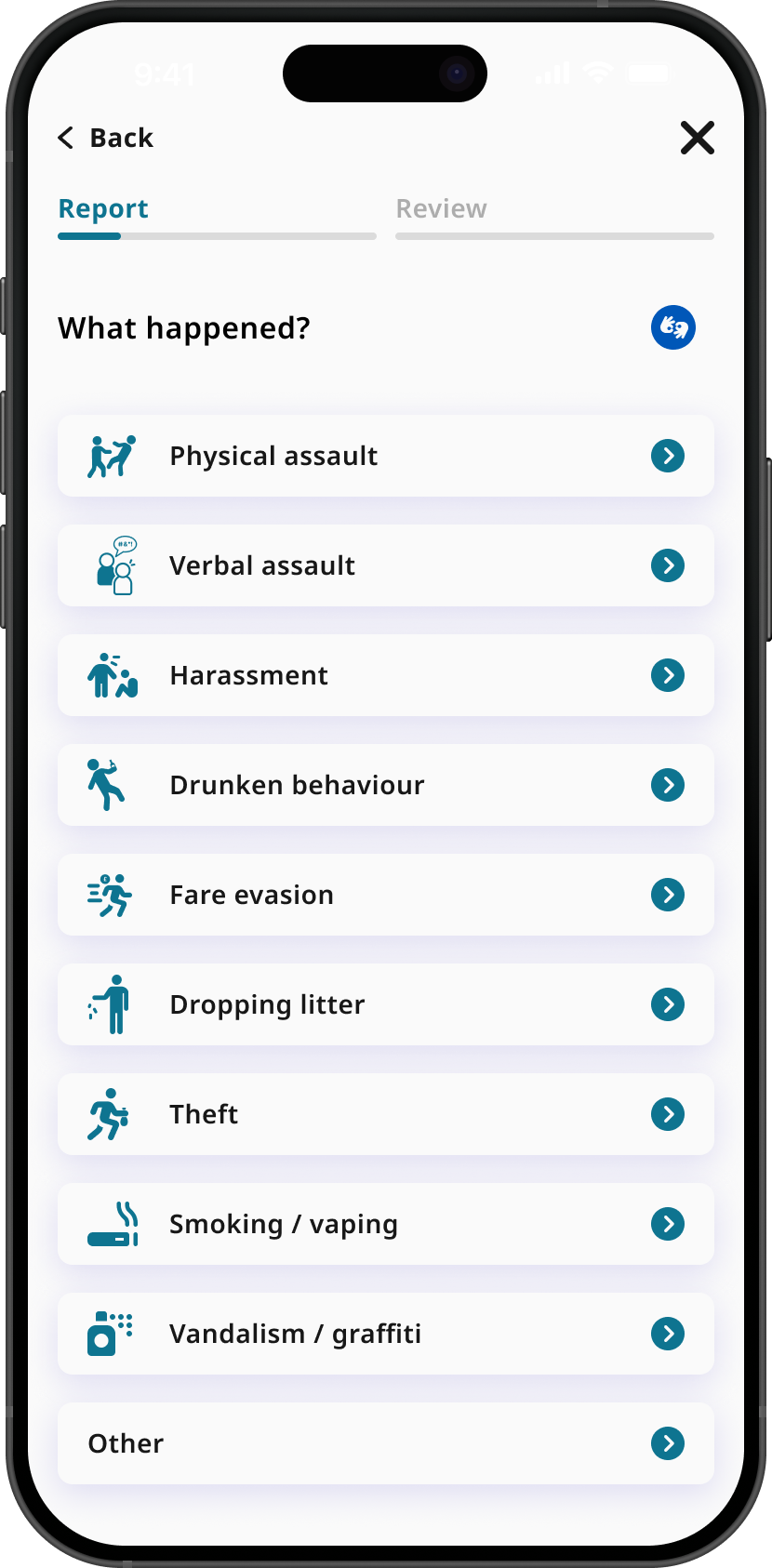
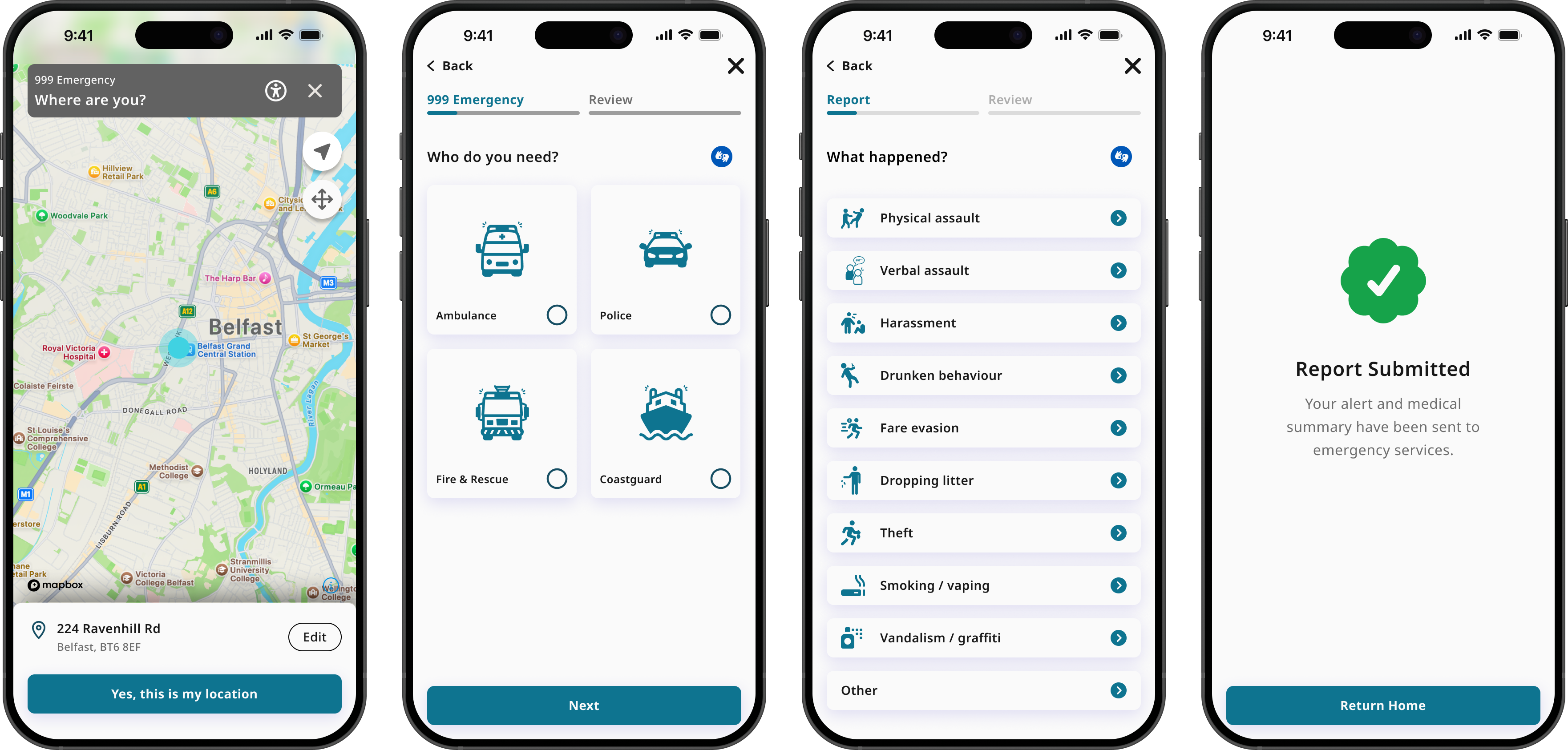
For example, users stalled selecting an incident type due to lack of iconography. I updated the button to include text and icons representing the situation. This process ensured the final design was based on evidence, not just my opinion, making the experience more usable and accessible.
07
IMPACT & OUTCOMES
The outcomes
Clearer emergency journey
Testing and iteration reduced ambiguity around key actions.
More accessible interaction
Accessibility requirements shaped hierarchy, interaction states and navigation.
Validated with intended users
Testing and iteration reduced ambiguity around key actions.
Scalable foundation
Sized and spaced for fast scannability under stress.
08
Validation
It reinforced designing beyond the interface — and letting evidence, not assumptions, lead.
High-fidelity designs were validated in usability testing with members of the Deaf community and users with varying communication needs — working alongside interpreters. Their feedback drove multiple rounds of iteration.
RYAN WALSH
TapSOS
Designing an accessible
emergency communication experience
END-TO-END UX

INCLUTECH
MOBILE APPLICATION
VIEW MORE

01
The Problem
Emergency services still assume you can speak.

999 in the UK relies on a voice call — which excludes anyone who can’t speak during a crisis, whether through disability, a medical event, or a situation where making a sound isn’t safe.
The brief: a fast, safe, accessible alternative that reduces stress while giving responders accurate information.
SUCCESS CRITERIA
Contact help without speech
Cut cognitive load under pressure
Meet a range of communication needs
Scale via a growth-ready system
02
WHY IT MATTERS
The scale of the need

1 in 3
adults in the UK are deaf, have hearing loss or tinnitus.
55+
Over half the population aged 55+ have hearing loss.
2.5B
people worldwide projected to have hearing loss by 2050
This wasn't an edge case. Designing for people who can't speak is designing for millions — and for anyone, on their worst day.
Sources: ¹ ² RNID, Prevalence of deafness and hearing loss · ³ WHO, Deafness and hearing loss
03
DISCOVERY
Owning discovery end-to-end
Evidence-based decisions, not assumptions

01
User research & journey mapping
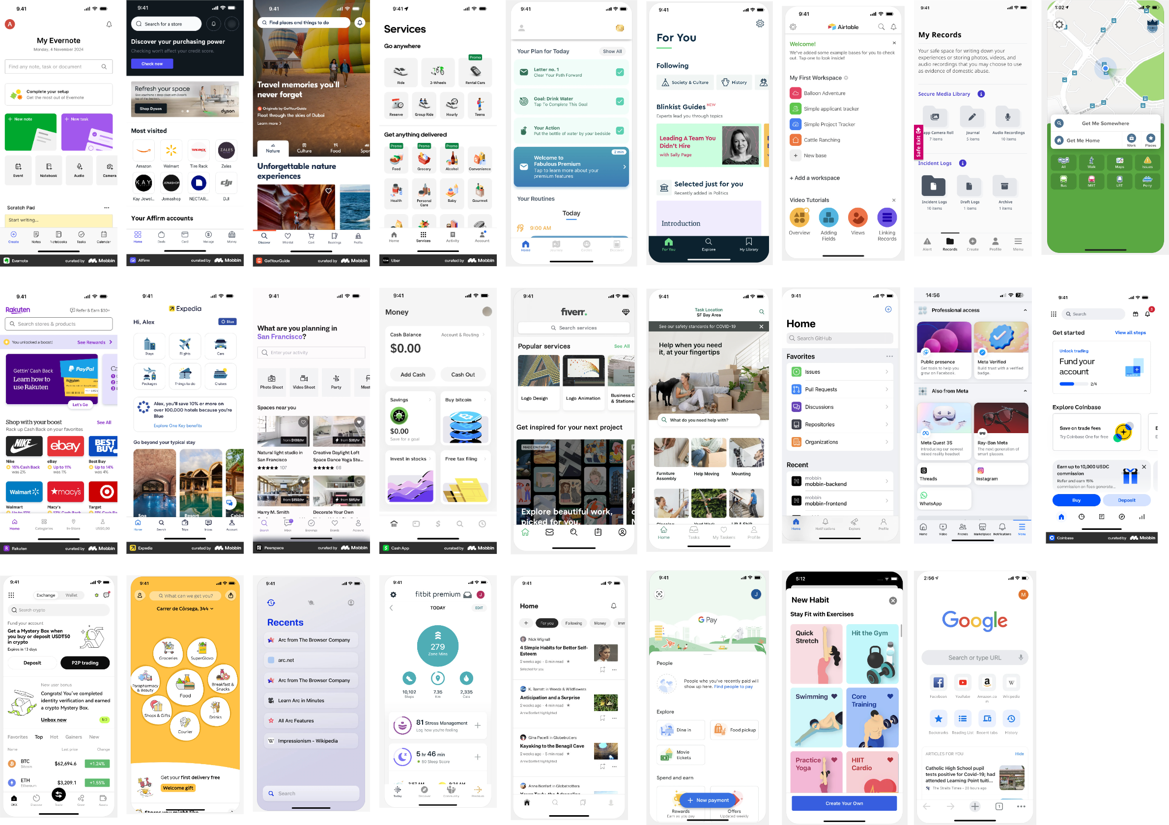
Understanding real moments of crisis and where voice fails people.
02
Competitor analysis
Direct and indirect — mapping what exists and where the gaps are.
03
Affinity mapping
Clustering findings into the themes that shaped priorities.
04
Site maps & storyboards
Sketching structure and scenarios before touching Figma.
05
Collaborative teamwork
Bringing the team into the problem to align early.
06
Defined success criteria
Clear measures so design choices could be judged, not debated.
04
Accessibility
Accessibility was not an afterthought
Accessibility was treated as a core design priority rather than a final consideration. Every design decision was made with the goal of reducing barriers and enabling users to act quickly and confidently when it mattered most.
Colour contrast
Legible for users with visual impairments.
Typography
Sized and spaced for fast scannability under stress.
Touch targets
Generous, for users with limited dexterity.
Navigation
Stripped to minimal decision-making.
Status indicators
Reassurance that an action actually completed.
05
From Sketch to System
Lo-fi to a scalable design system
I moved from lo-fi wireframes through mid-fidelity flows to interactive prototypes, simplifying interactions and hierarchy at each pass.
Colours, typography, spacing, components and interaction patterns were defined early — so the product stayed consistent, accessible and ready to grow.
System Foundations
Buttons
Input fields
Avatars
Navigation
Colour tokens
Type scale
Spacing
Status states
06
Validation
Testing with the people it’s for
High-fidelity designs were validated in usability testing with members of the Deaf community and users with varying communication needs — working alongside interpreters. Their feedback drove multiple rounds of iteration.
Instead of asking if they liked the interface, I observed their behaviour: could they complete the journey, where did they hesitate, what did they misunderstand, and where did the interface act unexpectedly? Testing challenged our assumptions.
For example, users stalled selecting an incident type due to lack of iconography. I updated the button to include text and icons representing the situation. This process ensured the final design was based on evidence, not just my opinion, making the experience more usable and accessible.
07
IMPACT & OUTCOMES
The outcomes
Clearer emergency journey
Testing and iteration reduced ambiguity around key actions.
More accessible interaction
Accessibility requirements shaped hierarchy, interaction states and navigation.
Validated with intended users
Testing and iteration reduced ambiguity around key actions.
Scalable foundation
Sized and spaced for fast scannability under stress.
08
Validation
It reinforced designing beyond the interface — and letting evidence, not assumptions, lead.
High-fidelity designs were validated in usability testing with members of the Deaf community and users with varying communication needs — working alongside interpreters. Their feedback drove multiple rounds of iteration.
TapSOS
Designing an accessible
emergency communication experience
END-TO-END UX
INCLUTECH
MOBILE APPLICATION
VIEW MORE
01
The Problem
Emergency services still assume you can speak.

999 in the UK relies on a voice call — which excludes anyone who can’t speak during a crisis, whether through disability, a medical event, or a situation where making a sound isn’t safe.
The brief: a fast, safe, accessible alternative that reduces stress while giving responders accurate information.
SUCCESS CRITERIA
Contact help without speech
Cut cognitive load under pressure
Meet a range of communication needs
Scale via a growth-ready system
02
WHY IT MATTERS
The scale of the need

1 in 3
adults in the UK are deaf, have hearing loss or tinnitus.
55+
Over half the population aged 55+ have hearing loss.
2.5B
people worldwide projected to have hearing loss by 2050
This wasn't an edge case. Designing for people who can't speak is designing for millions — and for anyone, on their worst day.
Sources: ¹ ² RNID, Prevalence of deafness and hearing loss · ³ WHO, Deafness and hearing loss
03
DISCOVERY
Owning discovery end-to-end
Evidence-based decisions, not assumptions

01
User research & journey mapping
Understanding real moments of crisis and where voice fails people.
02
Competitor analysis
Direct and indirect — mapping what exists and where the gaps are.
03
Affinity mapping
Clustering findings into the themes that shaped priorities.
04
Site maps & storyboards
Sketching structure and scenarios before touching Figma.
05
Collaborative teamwork
Bringing the team into the problem to align early.
06
Defined success criteria
Clear measures so design choices could be judged, not debated.
04
Accessibility
Accessibility was not an afterthought
Accessibility was treated as a core design priority rather than a final consideration. Every design decision was made with the goal of reducing barriers and enabling users to act quickly and confidently when it mattered most.

Colour contrast
Legible for users with visual impairments.
Typography
Sized and spaced for fast scannability under stress.
Touch targets
Generous, for users with limited dexterity.
Navigation
Stripped to minimal decision-making.
Status indicators
Reassurance that an action actually completed.
05
From Sketch to System
Lo-fi to a scalable design system
I moved from lo-fi wireframes through mid-fidelity flows to interactive prototypes, simplifying interactions and hierarchy at each pass.
Colours, typography, spacing, components and interaction patterns were defined early — so the product stayed consistent, accessible and ready to grow.
System Foundations
Buttons
Input fields
Avatars
Navigation
Colour tokens
Type scale
Spacing
Status states
06
Validation
Testing with the people it’s for
High-fidelity designs were validated in usability testing with members of the Deaf community and users with varying communication needs — working alongside interpreters. Their feedback drove multiple rounds of iteration.
Instead of asking if they liked the interface, I observed their behaviour: could they complete the journey, where did they hesitate, what did they misunderstand, and where did the interface act unexpectedly? Testing challenged our assumptions.
For example, users stalled selecting an incident type due to lack of iconography. I updated the button to include text and icons representing the situation. This process ensured the final design was based on evidence, not just my opinion, making the experience more usable and accessible.
07
IMPACT & OUTCOMES
The outcomes
Clearer emergency journey
Testing and iteration reduced ambiguity around key actions.
More accessible interaction
Accessibility requirements shaped hierarchy, interaction states and navigation.
Validated with intended users
The designed experience was tested with members of the Deaf community.
Scalable foundation
Reusable patterns created consistency as the product developed.
08
reflection
It reinforced designing beyond the interface — and letting evidence, not assumptions, lead.
The project strengthened my understanding of accessibility, collaborative product development, and evidence-based design, while demonstrating the value of validating decisions through continuous user feedback rather than relying on assumptions.